Table of Contents
Interior Harmony Pro Theme Documentation
Introduction
Customizing Your Website
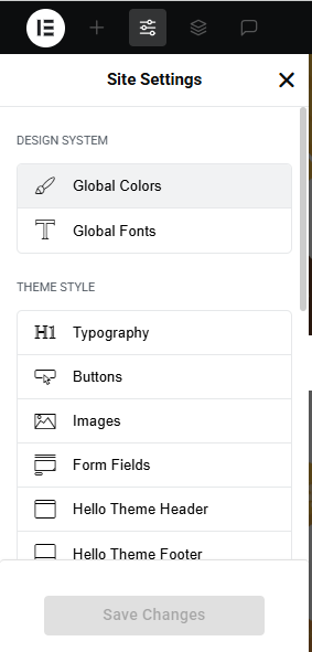
Global Settings
- Go to Elementor > Site Settings.
- Adjust typography, colors, and layout settings.
Header & Footer Setup
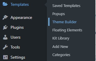
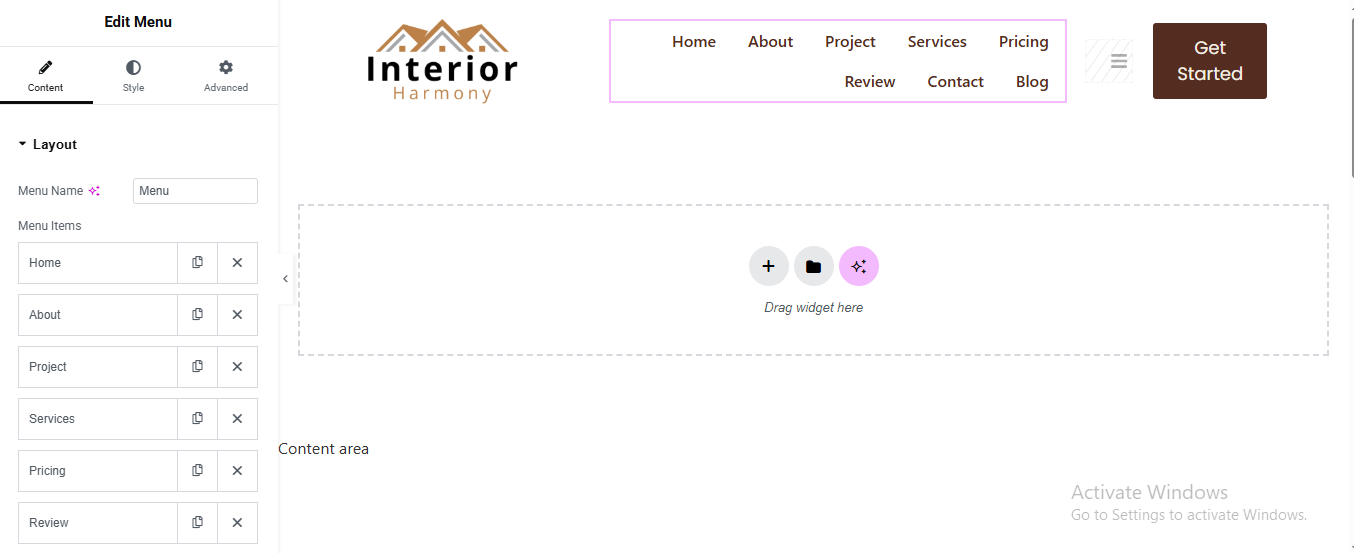
- Use Elementor Theme Builder to edit the header and footer.
- Customize the navigation menu, logo, and contact details.
You can drag and drop the elementor widget’s menu first. If you’d like, you can add items or simply drag each one, after which you can add a icon list from the widget and create my account and login page than apply a custom style from the style option.
you can add newslatter form, timing, contact details, logo, menu and if you wish in footer, and create you best design.
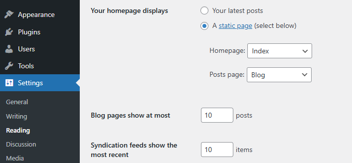
Home Page Setup
Using Pre-Built Layouts
Navigate to Setting >> Reading
Choose the Static Page option.
Choose an existing homepage or create a new one.
Add The Section in home page using elementor
Add components such as these using the Drag & Drop Builder:
- Hero Section
- About section
- 3 Box Section
- Projects Section
- History Section
- Our Gallery
- Counter Section
- Our Services Section
- CTA Section
- Pricing Section
- Work Process Section
- Review Section
- Team Section
- Contact Section
- Blog Section
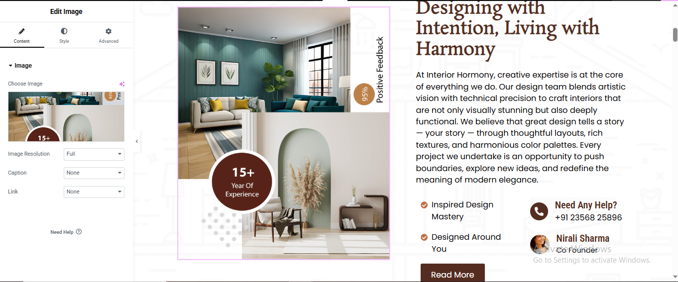
Main Hero Section
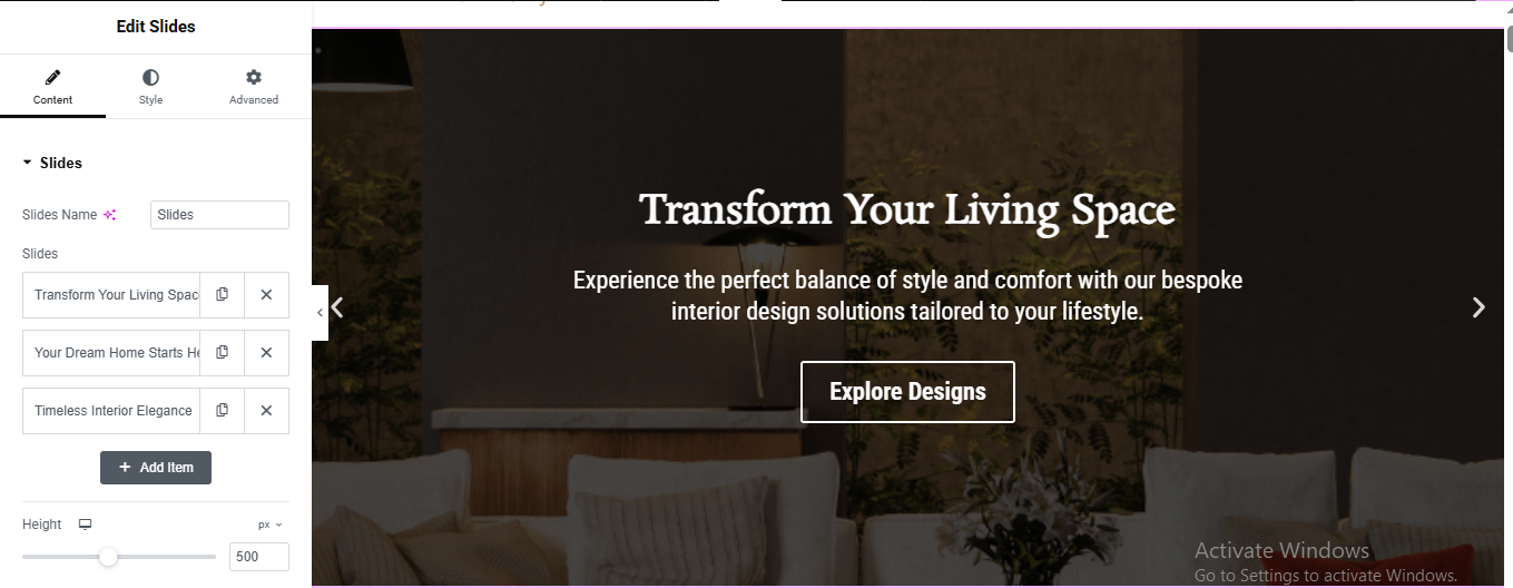
Add Slides Widget
- Add Slide Content
- added title, description and button
Add Background Image for all 3 slide
- Scroll down to Background
- Click Choose Image
- Upload your interior image
- Select image
- Click Insert Media
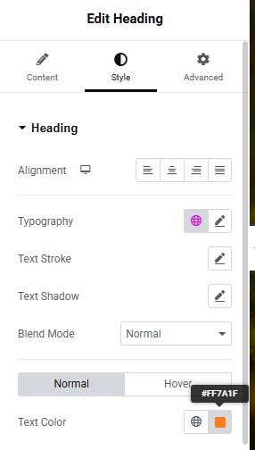
style the title, description and button
- title Style :
- Color: White, Size: 40–50px, Weight: 600
- Button Style :
- Text Color: White
- Background: Transparent
- Border Color: White
- Border Width: 1px
- Border Radius: 3px
Enable Navigation Arrows
About Section
Click “+” Add New Section
- Select 2 Columns Layout (50% / 50%)
Left Side Image Layout
- Add Main Image
- Click Left Column
- Drag Image Widget
- Upload your main image
Right Column Content Setup
- Drag Heading Widget for small heading
- Drag Another Heading Widget for main heading
- Style Settings:
- Font Size: 36px
- Font Weight: 600
- Add Description Text
- Drag Icon List Widget for features list
- Style:
- Icon Color: Brown
- Spacing: 15px
Add Contact Box
- Left Column: Phone
- Right Column: Profile
- Upload profile image
- Drag Button Widget
- Style:
- Background: Brown
- Text Color: White
- Padding: 12px 30px
- Border Radius: 5px
3 Box Section
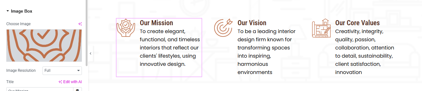
Click “+” Add Section
- Choose 3 Columns Structure (33% / 33% / 33%)
- Drag Image Box Widget for setup first box
- Upload mission icon image
- Title:
- Font Size → 20px
- Font Weight → 600
- Description:
- Font Size → 15px
- Line Height → 1.6
Right-click Column 1 → Duplicate for all box
This section effectively conveys the achievements and credibility of the pet care service, making it engaging and informative for visitors. 🐾🚀
Project Section
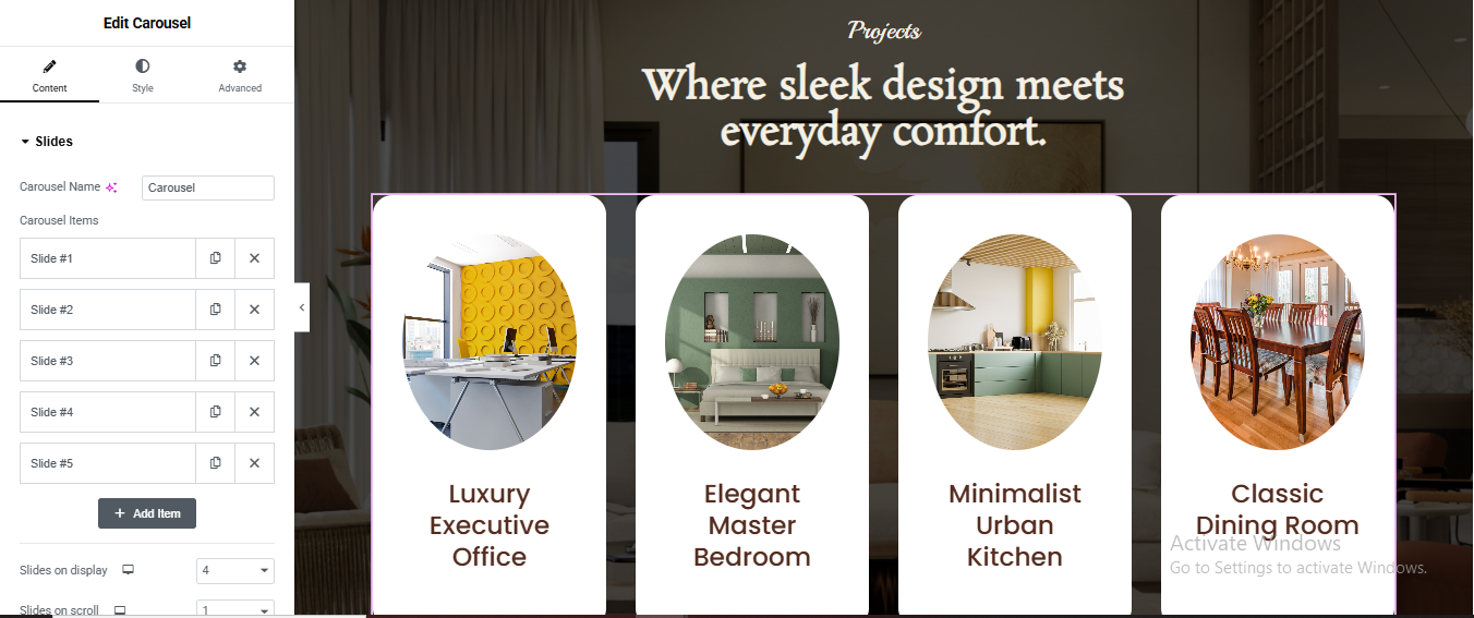
Click + Add Section
- Style → Background:
- Background Type → Classic
- Add background image
- Position → Center Center
- Size → Cover
Add Top Heading Area
- Drag Heading Widget for top small title
- Alignment → Center
- Color → Light Brown / Cream
- Font Size → 16px
- Font Style → Italic
Drag another Heading Widget for main title
- Add Carousel Use Loop Carousel (Elementor Pro)
- Go to Templates → Add New
- Choose → Loop Item
- Click Create
- 1Add Container
- Background → White
- Border Radius → 25px
- Padding → 30px
Add Image Widget
- Upload dynamic image.
- Style:
- Border Radius → 50%
- Width → 180px
- Align → Center
Add Heading Widget
- Alignment → Center
- Color → Brown
- Font Size → 20px
- Line Height → 1.3
Carousel Settings:
- Slides Per View → 4
- Slides to Scroll → 1
- Gap → 30px
- Infinite Loop → Yes
- Arrows → Show
- Dots → Hide
Style Arrows (Optional)
- Go to Style → Navigation:
- Arrow Size → 30px
- Arrow Color → White
- Background → Transparent
History Section
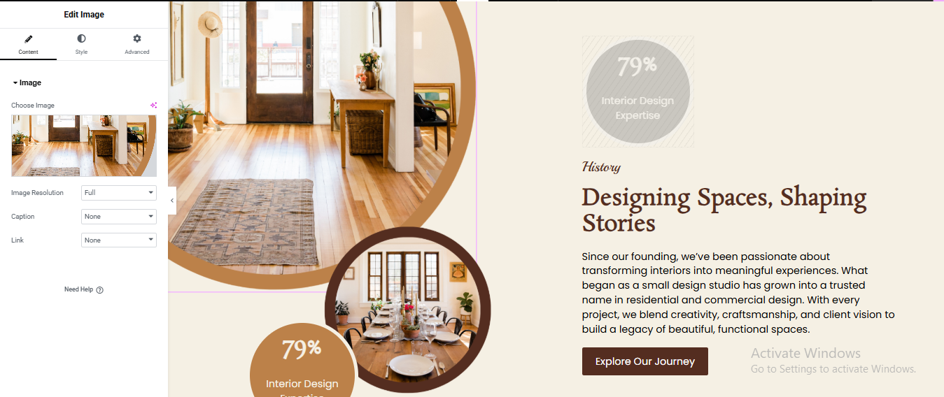
Click + Add Section
- Select 2 Columns (50% / 50%)
Left Column (Image Design Area)
- Drag Image Widget
- Upload your main interior image
- Style → Border:
- Border Radius → 300px (makes circle)
- Width → 450px
- Add Brown Border Circle Effect
- Click Image → Style:
- Border Type → Solid
- Border Width → 20px
- Border Color → Brown (#b37a45)
- Advanced (IMPORTANT):
- Position → Absolute
- Vertical Offset → 250px
- Horizontal Offset → 220px
- Z-index → 2
- Drag Heading Widget for 79% Badge Circle
- Alignment → Center
- Text Color → White
- Font Size → 22px
- Advanced:
- Background Color → Brown (#c68b59)
- Border Radius → 100%
- Width → 150px
- Height → 150px
- Padding → 35px
- Position → Absolute
- Vertical Offset → 350px
- Horizontal Offset → 40px
- Z-index → 3
Right Column Content
- Drag Heading Widget for top small title
- Drag another Heading Widget for main title
- Drag Text Editor Widget
- Drag Button Widget
- Background Color → Dark Brown
- Text Color → White
- Padding → 14px 28px
- Border Radius → 6px
Gallery Section
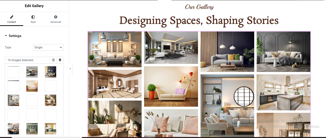
Click + Add Section
- Drag Heading Widget for top small title
- Drag another Heading Widget for main title
- Add Gallery Widget
- Add Images
- In Content Tab:
- Click Add Images
- Upload and select multiple images (8–16 images)
- Click Insert Gallery
Gallery Settings
- Content Tab → Settings:
- Type → Grid
- Columns → 4
- Image Size → Full
- Link → Media File
Counter Section
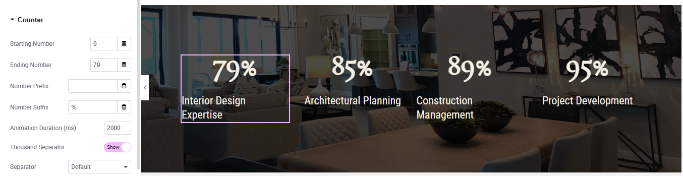
Click + Add Section
- Set Background Image
- Style Tab → Background
- Background Type → Classic
- Choose your background image
- Position → Center Center
- Size → Cover
- Repeat → No Repeat
Add Counter Widget
- Content Tab Settings
- Starting Number, Ending Number, Number Suffix, title
- Style Counter
Click Style Tab
- Number:
- Text Color → White
- Typography:
- Size → 48px
- Weight → 600
Duplicate for Other Columns
Service Section
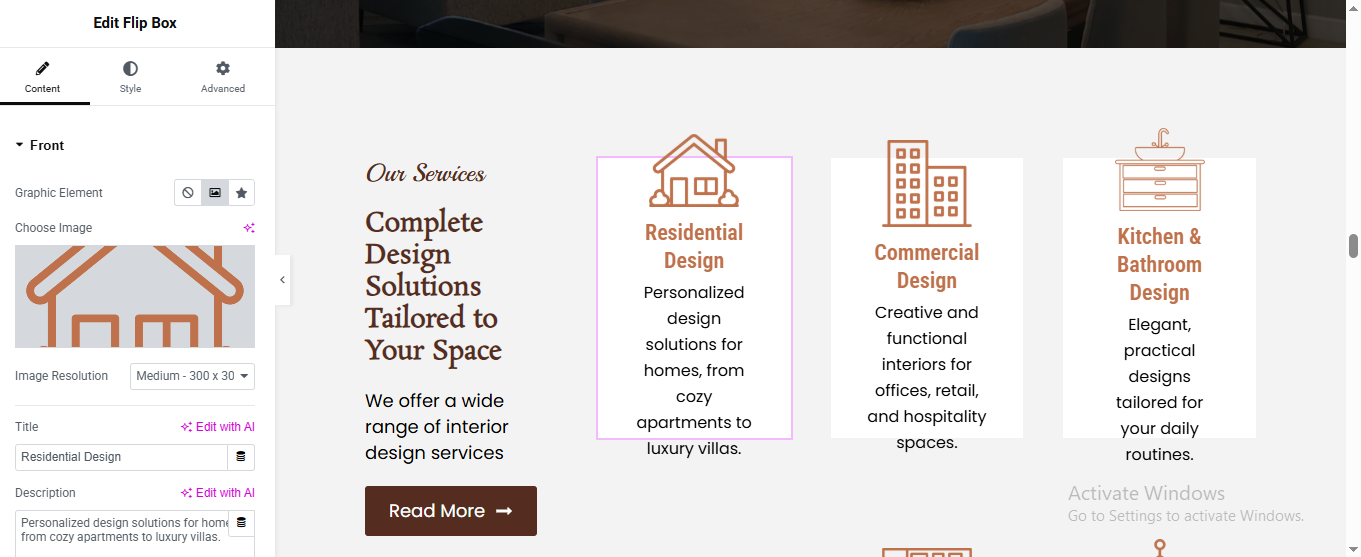
Click + Add Section
- Select 2 Columns Layout (40% / 60%)
Left Column (Text Area)
- Drag Heading Widget for top title
- Drag another Heading Widget for main title
- Drag Text Editor Widget for description
- Drag Button Widget for button
Right Column (Service Flip Boxes)
- Drag Inner Section
- Select 3 Columns
- Drag Flip Box Widget
FRONT SIDE SETTINGS
- added content, title, description
BACK SIDE SETTINGS
- added title and description
- Style Flip Box
Front:
- Background → White
- Padding → 30px
- Border Radius → 10px
- Icon Color → Brown
- Title Color → Brown
- Description Color → Dark Grey
Back:
- Background → Brown
- Text Color → White
Hover Effect
- Content → Settings:
- Flip Effect → Flip
- Direction → Up or Left
Duplicate Flip Box
CTA Section
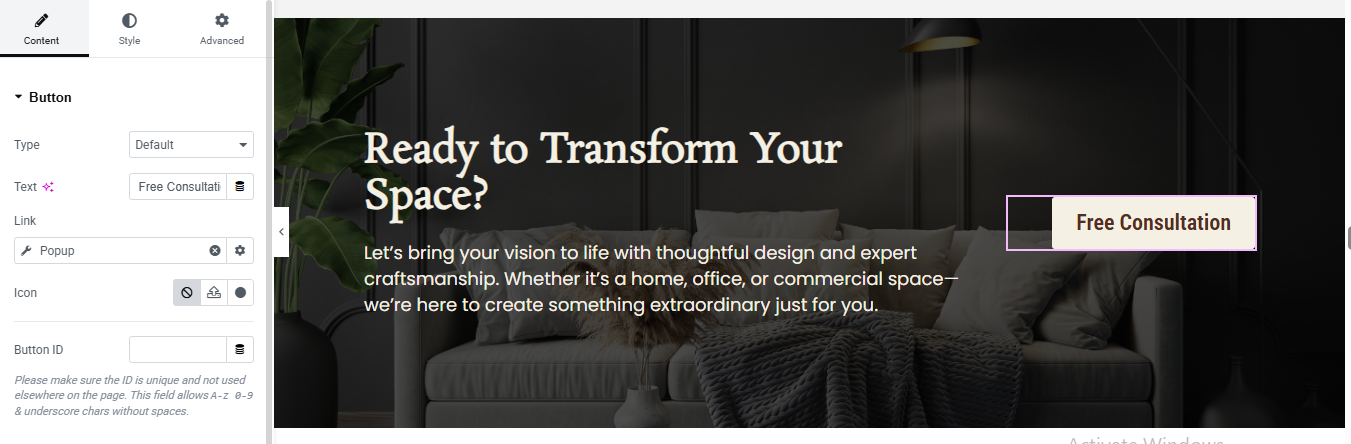
Click + Add Section
- Select 2 Columns Layout (70% / 30%)
- Advanced Tab:
- Padding:
- Top → 80px
- Bottom → 80px
- Left → 50px
- Right → 50px
Left Column
- Drag Heading Widget
- Text Color → White
- Font Size → 42px
- Font Weight → 600
- Line Height → 1.2
- Drag Text Editor Widget
Right Column (Button)
- Drag Button Widget
- Background Color → Transparent
- Text Color → Brown (#8b5e3c)
- Border Type → Solid
- Border Width → 2px
- Border Color → Brown
- Border Radius → 5px
- Padding → 15px 30px
Pricing Section
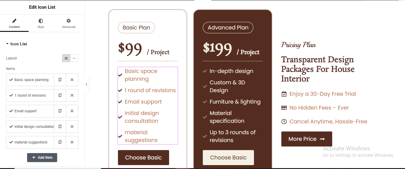
Click + Add New Section
- Select 3 Columns layout (33% + 33% + 33%)
- Create Left Pricing Card
- Search Heading widget
- Alignment: Center
- Background: White
- Padding: 30px
- Border Radius: 15px
- Border: 1px solid #ddd
Add another Heading widget for price
- Size: 36px
- Weight: Bold
- Alignment: Center
Add Divider
- Drag Icon List widget for feature list
- Drag Button widget for button
- Alignment: Center
- Background: Brown (#5a2d1c)
- Text color: White
- Border radius: 5px
- Padding: 12px 25px
Duplicate for all plan
Style Advanced Plan Card
- Style Advanced Plan Card (Brown Background)
- Click Column 2 → Style tab
- Background Color: brown
- Text Color: white
- Button background: White, Text color: Brown
Work Process Section
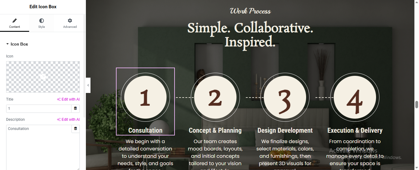
Click “+” (Add New Section) in Elementor
- Add the Heading widget for top small title
- Add another Heading widget for main title
Set Up Each Icon Box (Repeat x4)
- Drag “Icon Box” widget
- added icon, title, description
- Icon size: ~150px
- Title color: White, Bold
- Description color: Light gray/white
- Icon Position: Above title
- Add the Dashed Connecting Lines
Click the Section handle → Style tab
- Background Type: Classic or Image
- Upload your interior room photo
- Set Overlay → dark color at ~60%
Review Section
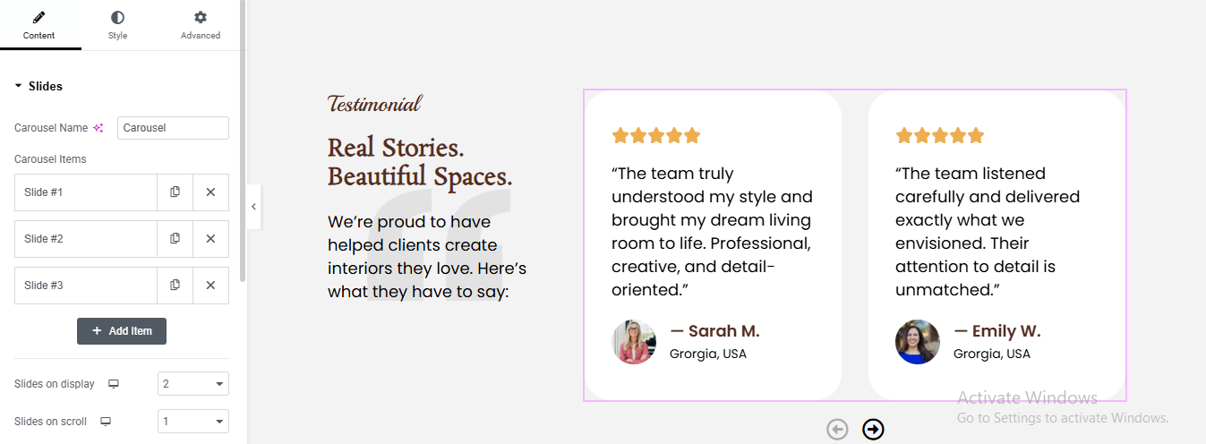
Click “+” Add New Section
- Choose 2 columns layout
- Set column ratio: Left ~35%, Right ~65%
- Set section background to light gray/white
Build the Left Column (Text Side)
- Add a Heading widget for top small tagline
- add another heading for main title
- added text editor for description
Add the Carousel to the Right Column
- Elementor Pro (has a built-in Carousel)
- Content tab → Slides you’ll see Slide #1, #2, #3
- Configure Each Slide
- added name, title, image, content/review, rating
Configure Carousel Display Settings
- Slides on Display
- Navigation
- loop
Style the Carousel Cards
- Card / Content Box:
- Background: White (#ffffff)
- Border Radius: 12px (rounded corners)
- Box Shadow: soft shadow for card effect
- Padding: 30px
Team Section Section
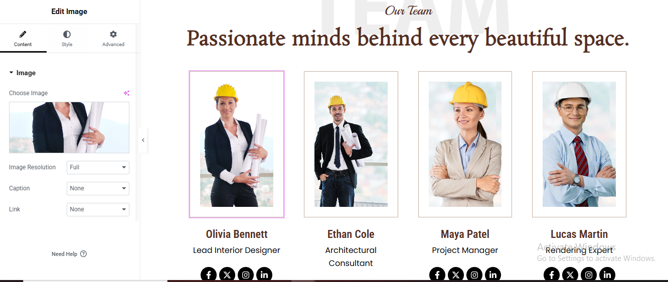
Click “+” Add New Section
- Add Heading widget top small title
- add another heading widget for main title
Create the 4-Column Team Cards Row
- Click “+” Add New Section below the heading
- Choose 4 columns layout
Build One Team Member Card
- Drag Image widget
- Drag Heading widget
- Style:
- Color: Dark brown (#8B3A0F)
- Font: Bold, 18–20px
- Align: Center
- Add Job Title Drag Heading widget
- Add Social Icons Drag Social Icons widget
Style the Card Container
- Background: White
- Border: 1px solid #e0e0e0
- Border Radius: 8px
- Padding: 20px
- Box Shadow: soft shadow
Duplicate the Card for All 4 Members
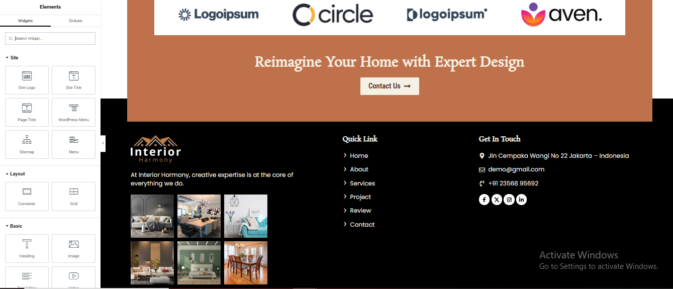
Contact Section
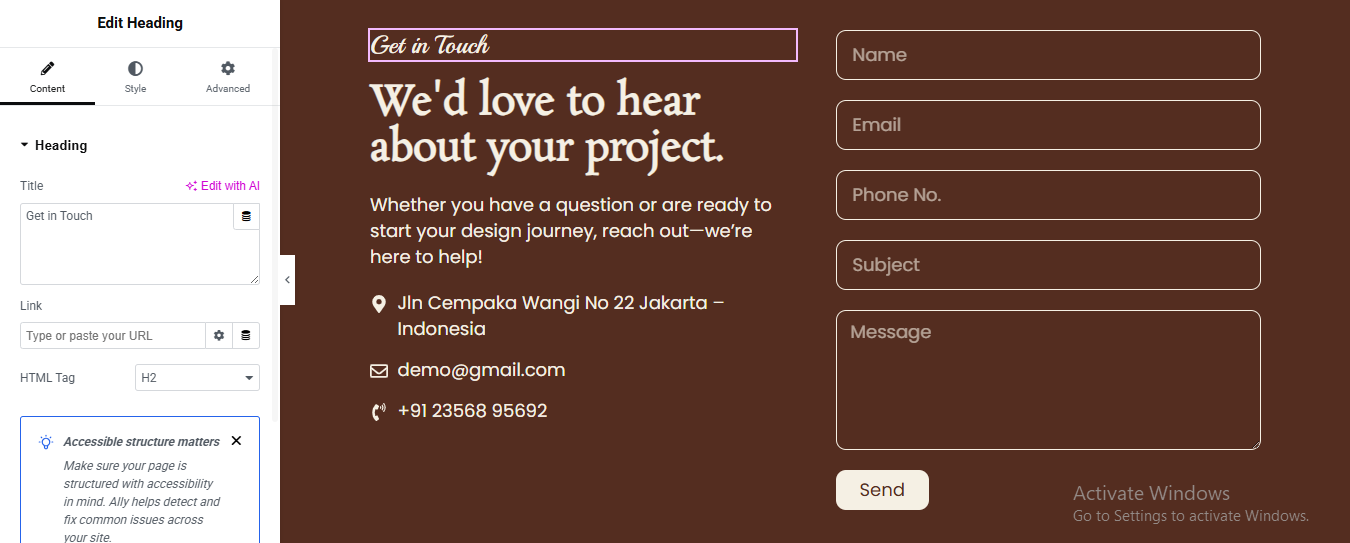
Click ➕ Add Section
- Select 2 Columns layout (50% / 50%)
- Set Background Color
- Click Section
- Go to Style → Background
- Choose Classic
- Set color: #6B3A22
Left Column
- Drag Heading Widget for top small tagline
- Drag another Heading Widget for main title
- Add Description Text
- Add Contact Info
- Drag Icon List Widget added 3 items
- location, email, phone
Right Column – Add Contact Form
- Drag Form Widget
- added field if you wish
- Style Form Fields
Fields
- Background: Transparent
- Text Color: #FFFFFF
- Border Color: #E5C9B3
- Border Width: 1px
- Border Radius: 8px
- Padding: 12px
Button
- Background: #E5C9B3
- Text Color: #000000
- Border Radius: 8px
- Padding: 12px 25px
Blog Section
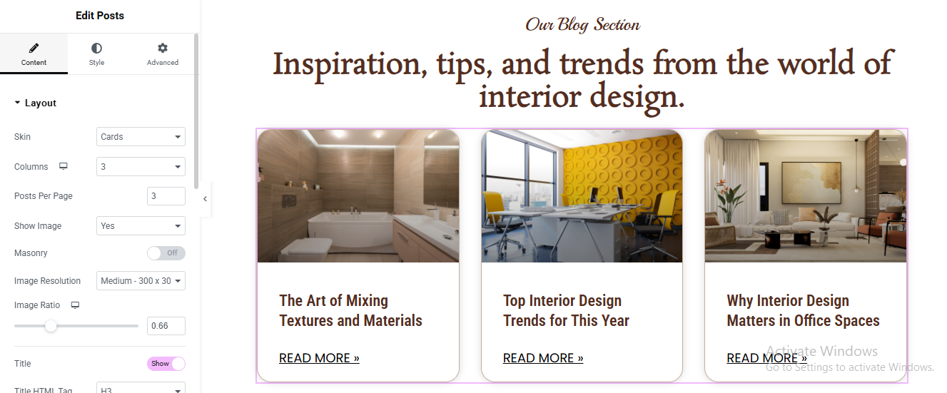
Click ➕ Add Section
- Drag Heading Widget for top small tagline
- Drag another Heading Widget for main title
- Add Posts Widget Drag Posts Widget below heading
Layout Settings (IMPORTANT)
- Go to Content → Layout
- Skin: Cards
- Columns: 3
- Posts Per Page: 3
- Image Position: Top
- Masonry: OFF
- Image Size: Medium Large
- Image Ratio: 0.66
- Show Image: Yes
- Show Title: Yes
- Show Excerpt: No
- Show Meta: No
- Show Read More: Yes
Style Cards
- Go to Style → Cards
- Background Color: #FFFFFF
- Border Radius: 15px
- Border Width: 1px
- Border Color: #E5D3C5
- Box Shadow: Yes
With a refined aesthetic, thoughtfully crafted layouts, and a user-friendly experience, the website beautifully showcases its expertise in creating elegant and functional spaces. Its modern design, attention to detail, and seamless navigation reflect professionalism, creativity, and trust—making it an ideal choice for clients seeking inspiring and personalized interior design solutions. ✨🏡